Vida Sana
In 2014, the Centro Adventista de Vida Sana, with a solid reputation as a preventive health institution in Argentina, faced the challenge of updating its image and communication.
The institution, known for its focus on holistic health and prevention, was constrained by an outdated visual identity and a fragmented communication strategy that did not reflect the quality of its care or the warmth of its staff.
The challenge: renewing a historic health institution
The challenge was significant: how to modernize the brand without losing its essence, optimize every participant touchpoint, and enhance the experience from the first interaction to well after the health program had concluded.
Adding to this was the complexity that Vida Sana lies at the thin line between the hospitality industry and the healthcare industry.
Rediscovering the essence
Our approach was based on the premise that the true strength of Vida Sana lay in its people.
We began with a thorough content audit, reviewing everything from promotional materials to press mentions dating back to the 1980s.
We conducted interviews with a wide range of stakeholders, from directors and doctors to cleaning staff and long-term participants. This process helped us identify a recurring theme: the exceptional human quality and warm, professional care were the real differentiators of Vida Sana.
With this clear understanding, we designed a strategy to humanize the brand at every interaction. We used tools like user journey maps and personas to visualize the entire participant experience, from their first online search to post-program follow-up.
A comprehensive and gradual approach
The transformation was implemented progressively, covering several interconnected fronts:
Digital renewal
The first step was to redesign the website from the ground up. We developed a new site using WordPress, with a responsive design that prioritized the mobile experience. The information architecture was designed to be more accessible and easy to navigate, significantly reducing phone inquiries about frequently asked questions.
Using agile methodologies, we created variations and prototypes and then validated them with the various stakeholders. This helped us reach solutions that added real value, rather than being merely aesthetic.
“Participants praised the clarity of the new site,” the customer service team told us. “Now they can find information about the programs and prices without having to call, which freed up a lot of our time.”
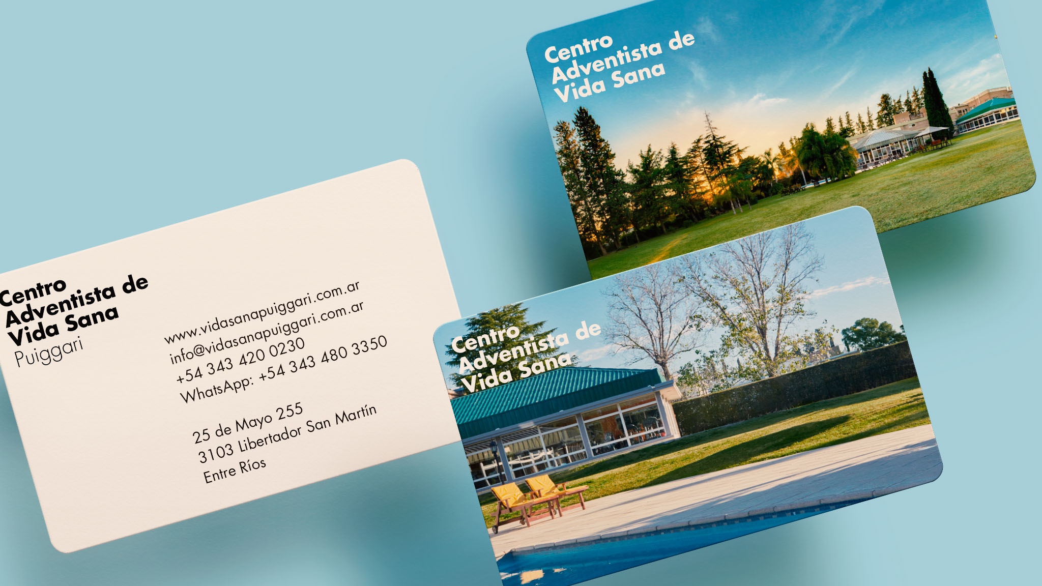
Authentic visual identity
We redefined the visual identity to reflect the warmth and professionalism of Vida Sana, using a color palette inspired by the eight natural remedies, which are key to its philosophy.
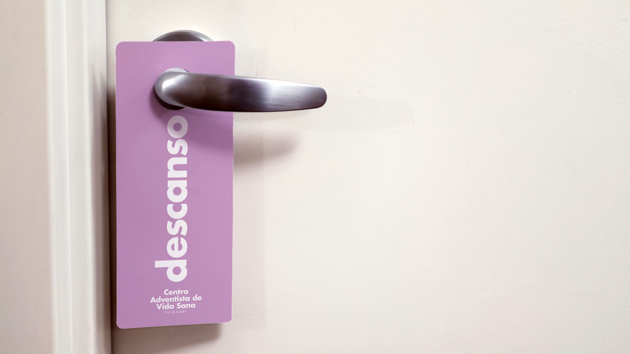
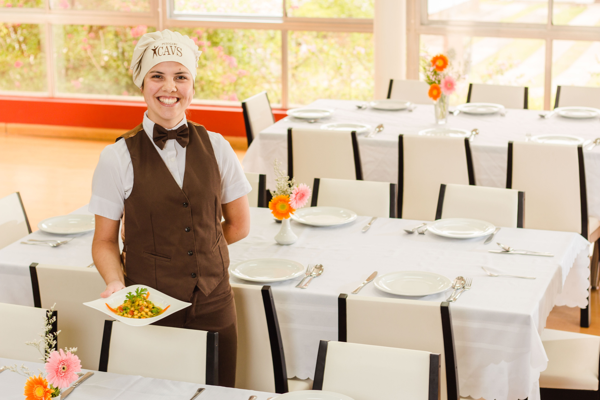
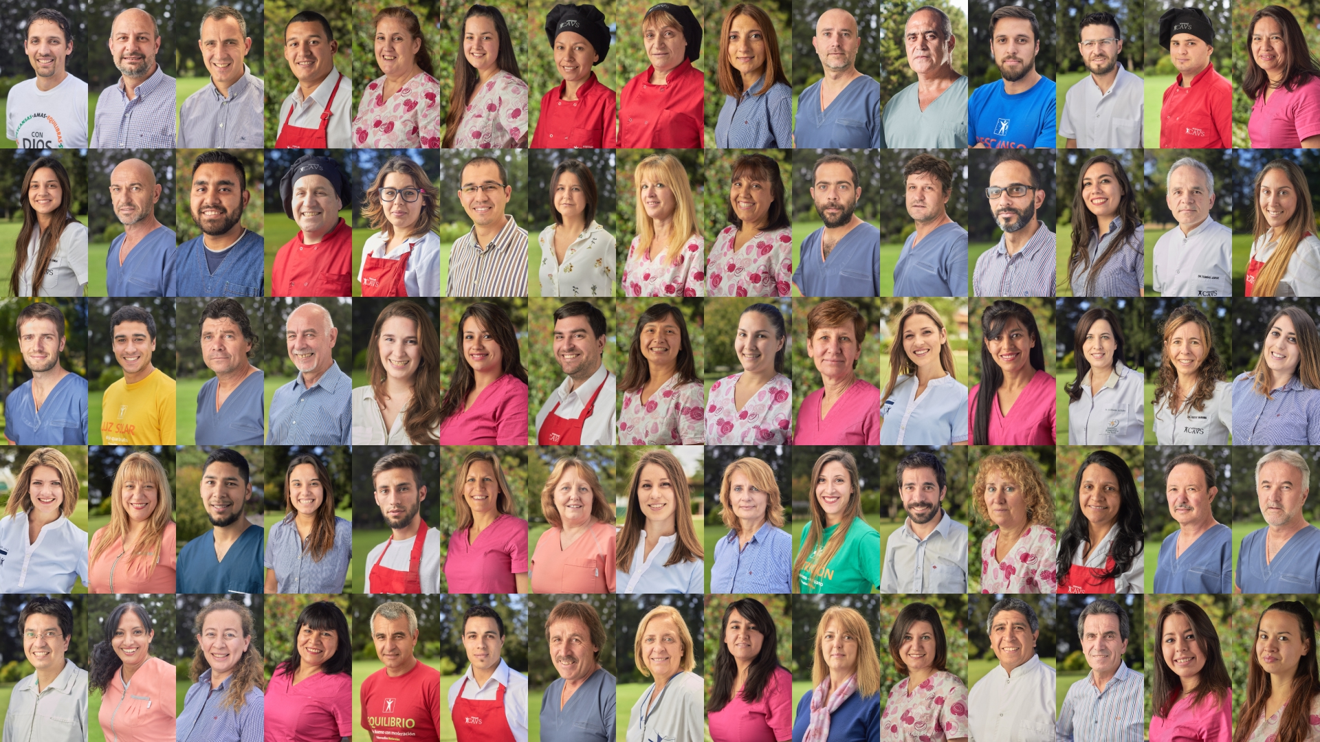
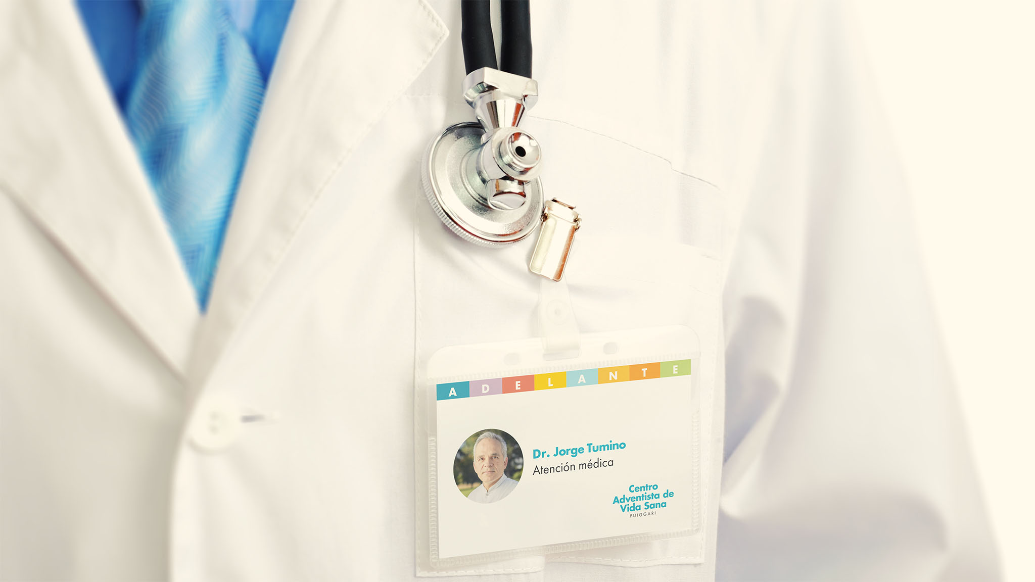
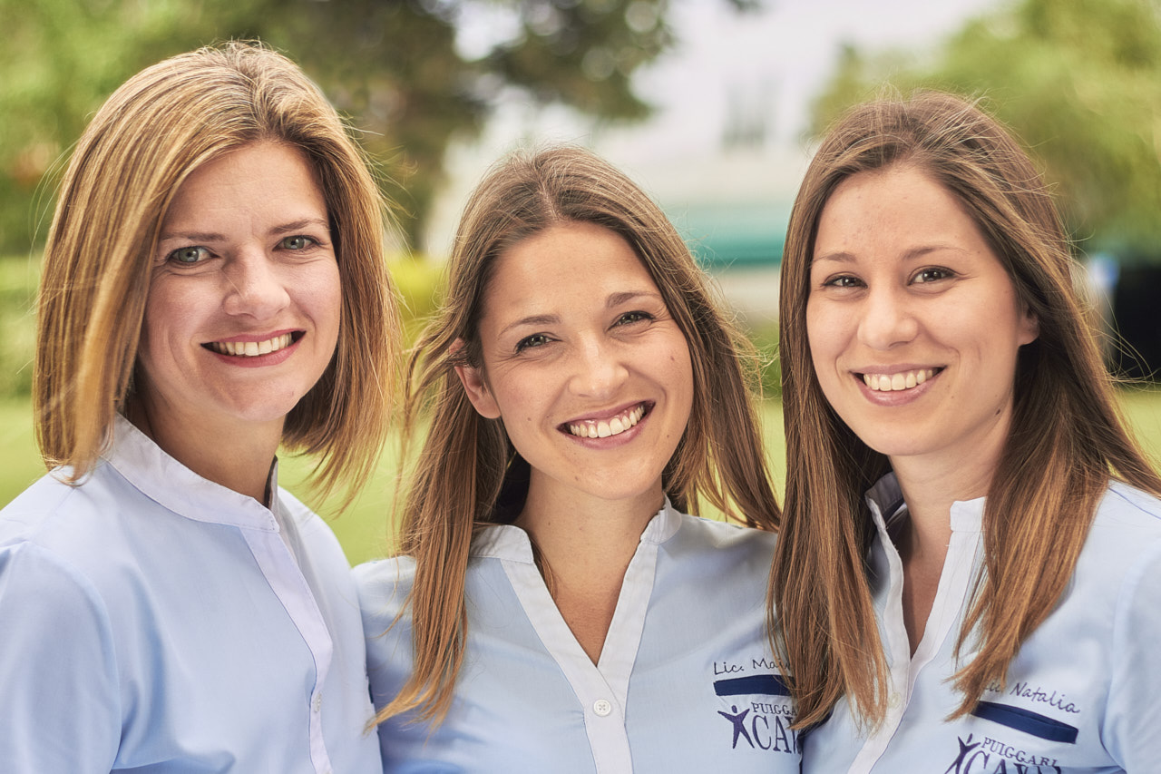
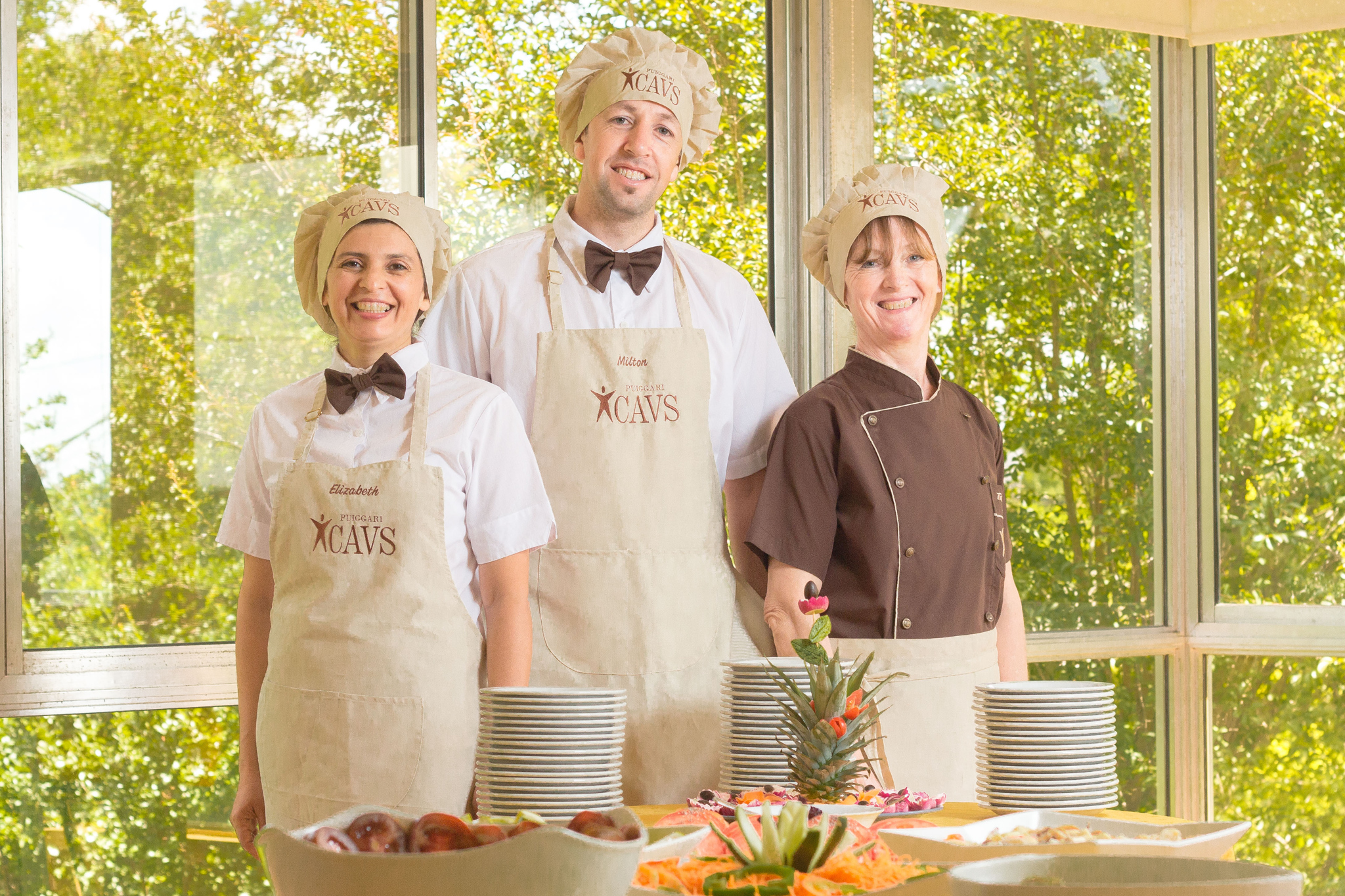
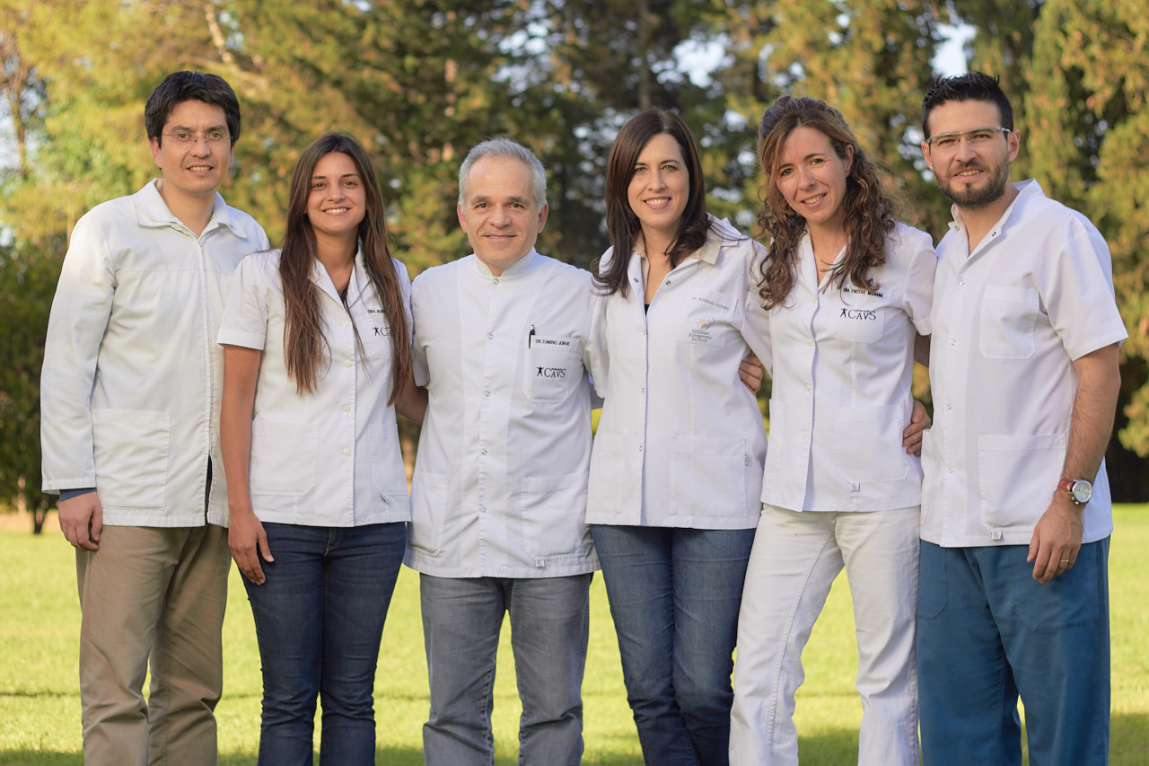
Instead of using stock photos, we decided to do photo sessions with the staff, capturing them in their workspaces.
We wanted participants to be able to recognize the same people they saw in the photos when they arrived at the clinic, creating an immediate, more personal connection.
Process and communication optimization
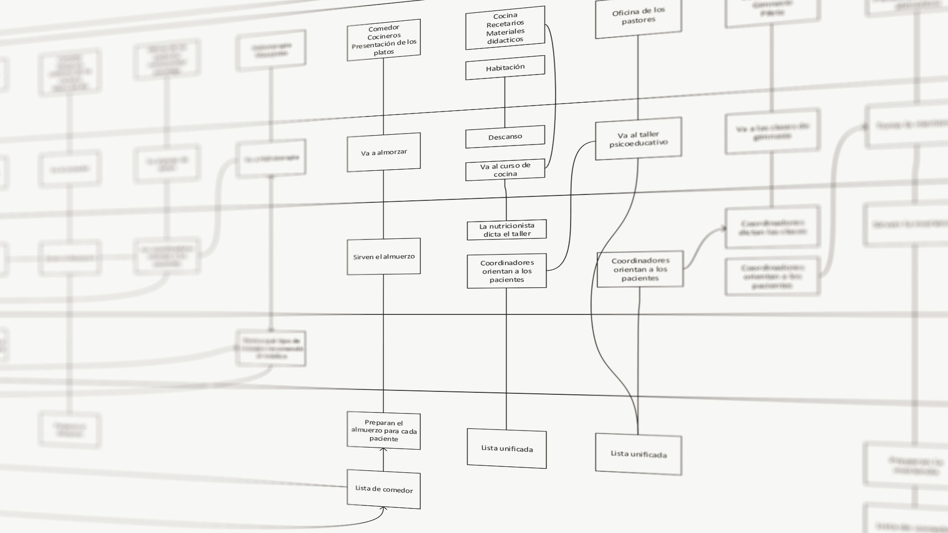
A key finding from our analysis was the overload of information participants experienced upon arrival. They were exhausted from the journey and were handed piles of papers with irrelevant or confusing information, frustrating them. We redesigned how the information was delivered, making it gradual and contextual.
Additionally, we redesigned internal forms, such as the laundry form, which helped reduce errors, and we created concise materials, like a brochure that condensed all the necessary information for participants upon arrival, as well as a document the sales team could send via WhatsApp with program details.
“The new information organization made our work much easier,” commented one of the coordinators. “It's no longer disorganized piles of papers; everything has a purpose and a moment.”
Content strategy
To maintain the connection with participants after the program ended, we implemented a content strategy for the blog, with contributions from the Vida Sana team.
We started with the psychoeducation and nutrition areas, and soon doctors and physical education instructors joined in. Now, practically the entire team creates various types of content that go to social media, television or even printed materials like brochures or recipe books.
A comprehensive transformation
The renewal of Vida Sana had a profound and multifaceted impact:
Greater communication efficiency
The clarity in communication reduced redundant inquiries, allowing staff to focus on more valuable tasks.
Enhanced user experience
From website navigation to the stay at the clinic, every touchpoint became more intuitive and pleasant.
Long-lasting connections
Content created by employees kept participants connected even after the program ended.
Strengthening of internal culture
Staff felt part of the process, fostering a greater sense of belonging and pride by finding solutions collaboratively.
Lessons learned and looking ahead
This project demonstrated the power of putting people at the center of transformation.
We learned that:
- Authenticity is a brand's greatest asset in the healthcare sector.
- Technology should facilitate human connection, not replace it.
- Sustainable success depends on the commitment and active participation of the entire team.
With this strong foundation, Vida Sana is ready to continue evolving and adapting to the needs of its participants, always maintaining its focus on the human quality that sets them apart.